


Category
Naming / Brand Identity
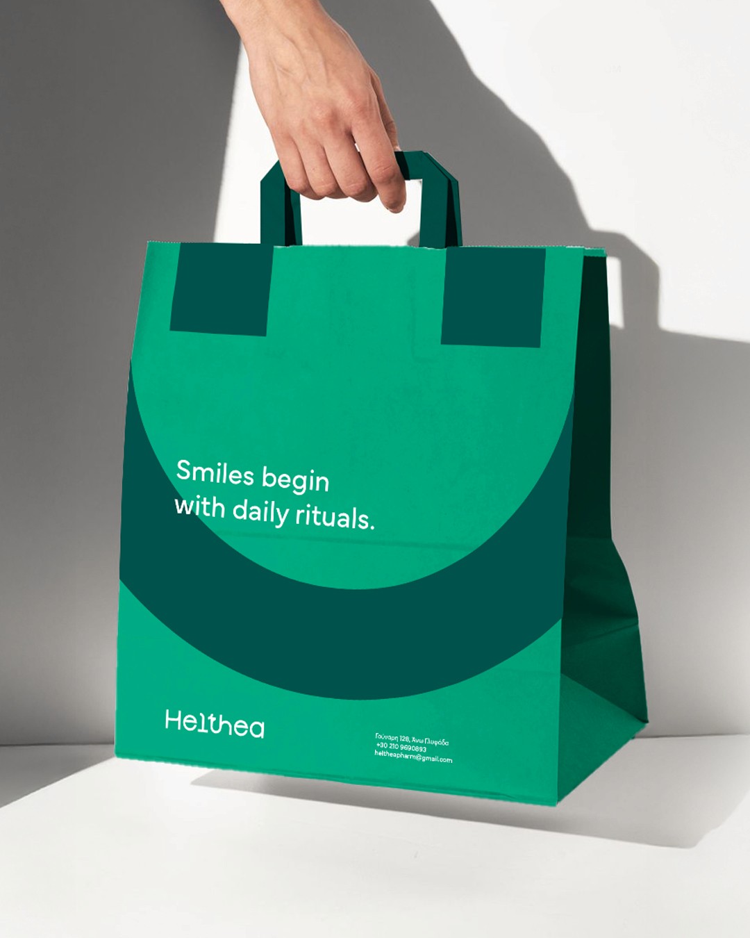
For Helthea Pharmacy, we created the naming and developed the visual identity around it.
The logo is built on the letter H, featuring gentle curves that evoke a smile.
The logo and overall identity were designed to embody a conscious, proactive approach to care. Not as a reaction, but as a daily ritual of wellbeing. The logo uses a friendly, rounded typeface, avoiding rigid, technocratic forms. Its shape is soft yet precise, conveying trust, care, and approachable professionalism.
A distinctive feature of the logo is the typographic merging of the letters “t” and “h,” symbolizing the union of health and light, the convergence of Health and Thea.
This morphological union becomes a vessel for both the brand name and its philosophy. The color palette is based on shades of green, carefully chosen to evoke feelings of health and purity, while psychologically fostering a sense of calm and trust.
Next work


(Explore all Work)